
Case Studies
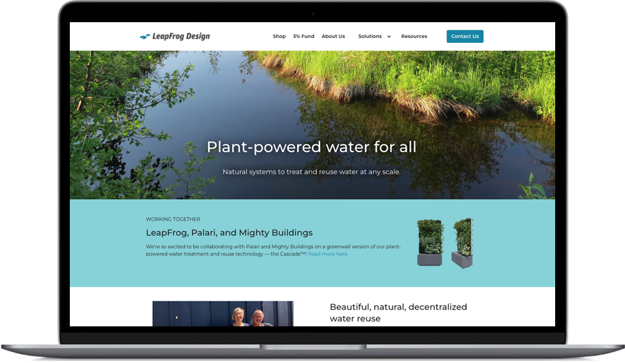
Case Study: LeapFrog Design
Challenge: LeapFrog needed to connect with multiple audiences — home owners, investors, distribution partners, water advocates, and policy makers. As an early stage business, we needed an overall strategy that could flex and pivot as we learned more about the market and our customers and partners. We needed a marketing plan that could shift to accommodate opportunities as they arose. And we needed it all on a very lean budget.
Solution: As Fractional Director of Marketing and Communication and then Head of Growth, Janet collaborated with sales, product, and operations teams to outline long- and short-term strategies and executing marketing activities across the website, social channels, sales tools (decks, printed handouts, PDFs, etc). We utilized analytics from Google Analytics, HotJar, LeadFeeder and other sources to evaluate marketing initiatives, retool, and refine. We used micro-campaigns on Instagram to find and connect with homeowners interested in tiny homes, achieving higher-than-predicted engagement in every campaign. Janet worked with associations and tradeshows to secure speaking engagements for our CEO. We used our social presences to amplify messaging from our partners and engage people in conversation around water reuse. Janet worked with our CEO and Head of Product to create content such as articles and FAQs for our website and other channels. Janet refined and evolved LeapFrog’s brand over time, striving for an open, friendly, vibrant look and feel focused on the promise of nature-based water reuse and the power of nature to help people thrive.

Case Study: Qualtik
Challenge: Qualtik needed someone to build their marketing and brand from the ground up. We needed to connect with a very specific audience within the banking community; people utilizing an extremely arduous process for which there was now a much faster, easier solution, but since no one thought there was a better way, no one was looking for our new solution. And we needed to be sensitive to the audience’s extreme risk-aversion.
Solution: As Fractional Director of Marketing, Janet built the brand and strategy with an eye toward meeting our customers where they were, educating them about this new solution, and giving them the information they needed to get comfortable with trying something new. We aimed for an open, friendly, reliable look and feel.
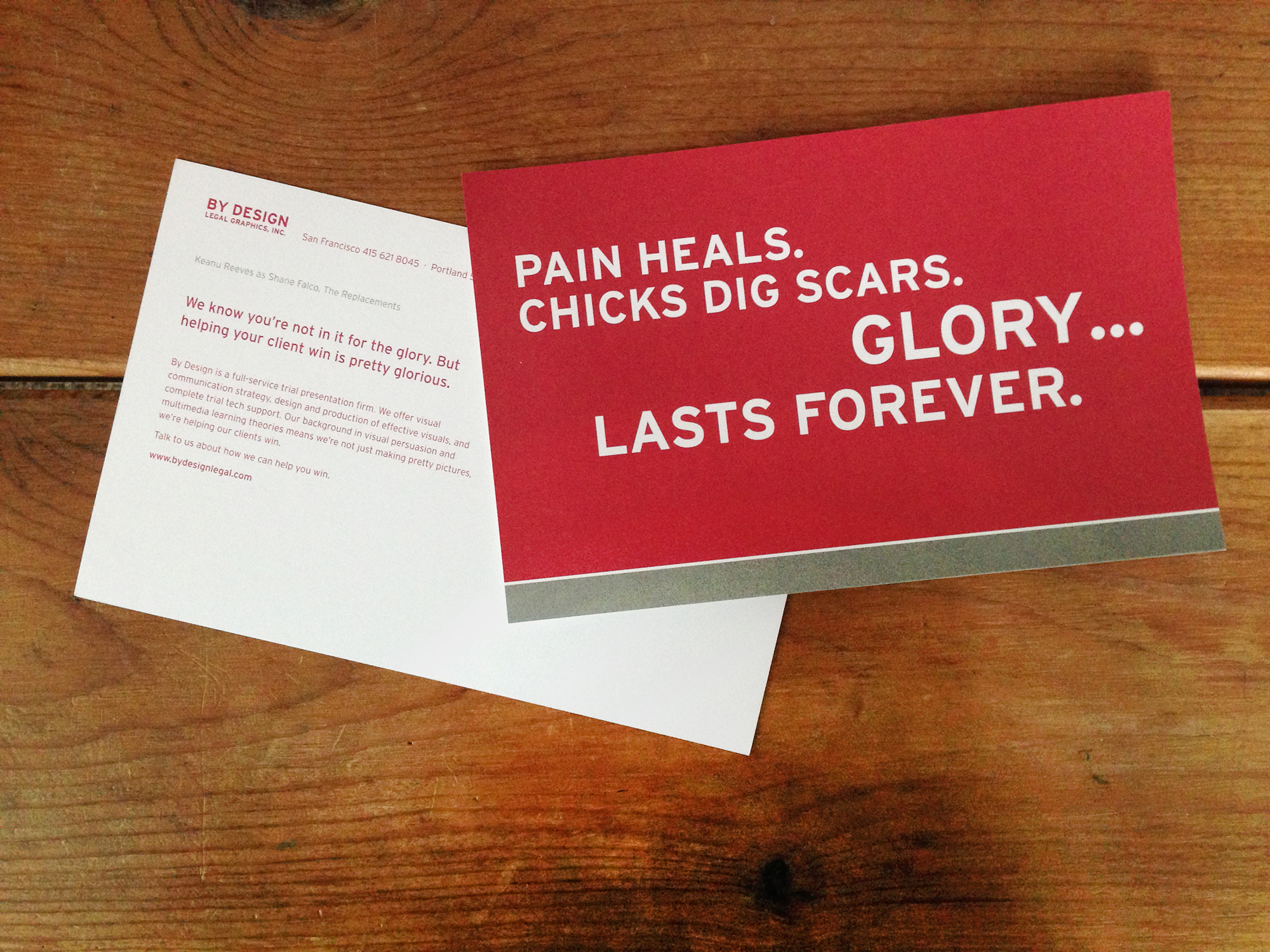
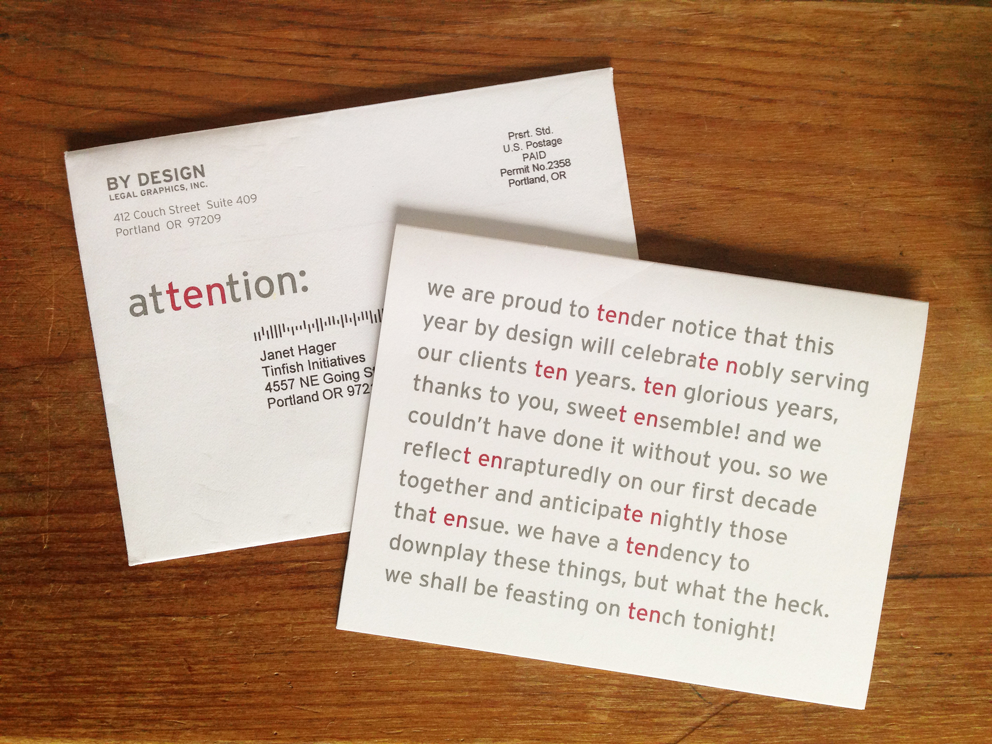
Case Study: By Design Legal
Challenge: By Design needed an ongoing keep-in-touch campaign to stay top-of-mind with their clients — intellectual property attorneys, who tend to love word puzzles. We devised multiple series based on fun and engaging wordplay.
Solutions: One early holiday card featured traditional pairings of red and green concepts, but colored incorrectly (what should be green is red, and vice versa). On the inside of the card the word puzzle is resolved with a properly colored pairing.
For their tenth anniversary card, we wrote a legalese-sounding announcement, highlighting the word “ten” ten times in the text.
For over ten years we have created an annual series of six keep-in-touch emails simply designed to entertain and keep By Design top-of-mind. Often these feature clever wordplay that ties into a gentle reminder of By Design’s unique capabilities.

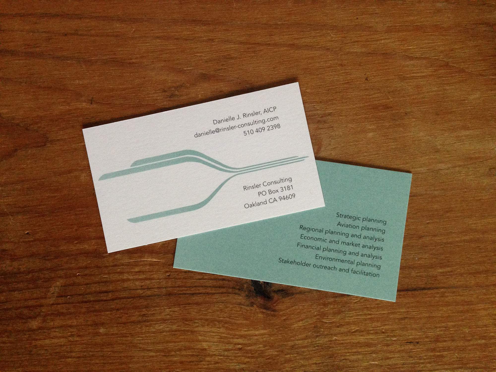
Case Study: Brand for Rinsler Consulting
Challenge: We needed a mark that would evoke the world of airports, airplanes, and air travel, but that would also speak to transport by train. Additionally, we wanted to portray an image of calm confidence.
Solution: The color and simple lines convey that calm confidence we were after. The swooping shapes can be read as movement, transit maps, or air currents, all resonant with our goals. The rounded ends of the lines evoke the profile of a train or airplane.
Case Study: Brand for Switchback Group
Challenge: Switchback Consulting works with communities and organizations to create strategic culture and arts plans to build economic development, social cohesion, cultural vitality, and sustainability. They strive to develop plans that reflect local culture and the interconnection of its natural spaces and sense of place.
Solution: For the mark we drew inspiration from a folktale in which a hummingbird does everything it can to help its community in the face of a forest fire. In the story the hummingbird flies back and forth carrying water droplets to the fire. The idea of people doing whatever they can to help their community, combined with the stitching together created by the hummingbird’s flight pattern resonated with our goals for the brand.
Case Study: Brand for Revolution Accounting
Challenge: We wanted the mark to reinforce the idea of revolution and thinking outside the box, and also reference the owner’s deep involvement in the local biking community.
Solution: The stylized bike gear and pedals hit all the marks for the client. We kept the color in the blue family to convey reliability and stability but chose a teal to convey vibrancy, new ideas, and creative thinking.
Let’s have a conversation.
call 503 753 8043
send an email